> ## Documentation Index
> Fetch the complete documentation index at: https://docs.dqlabs.ai/llms.txt
> Use this file to discover all available pages before exploring further.
# Metric Results
> How Prizm calculates a metric's anomaly distribution, drift, outlier percentage, and health state, plus the Overview, Timeline, and Audit tabs.
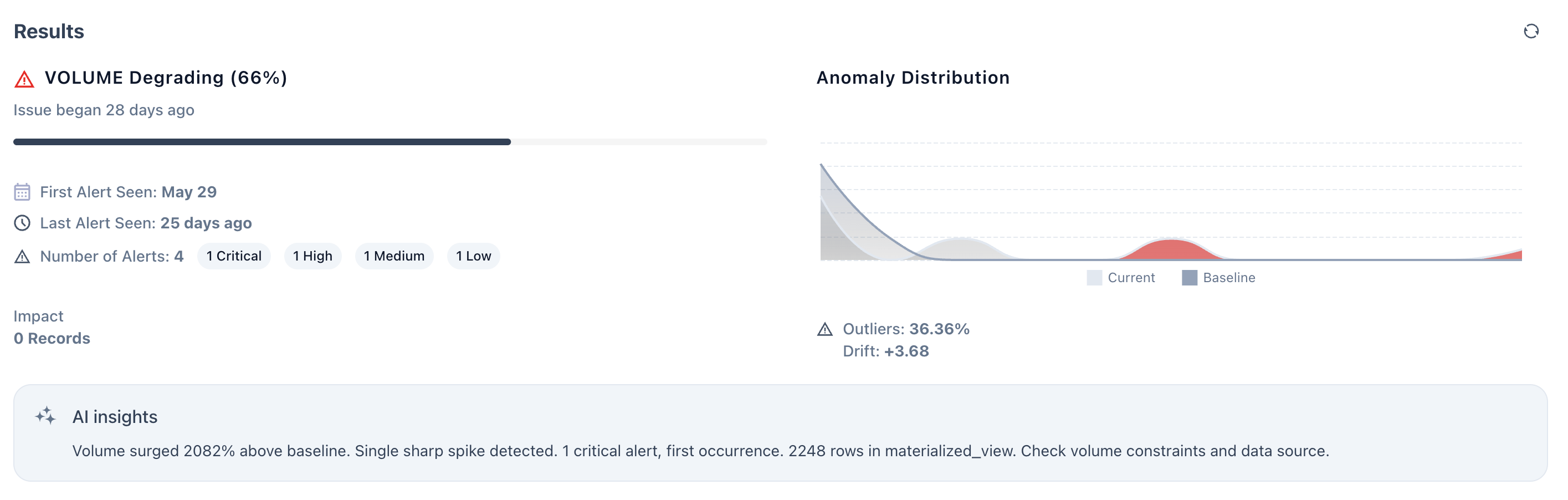
Every metric in Prizm has a **Results panel** that tells you not just what happened, but how abnormal it is, how long it has been happening, and how urgent it is to act. This page explains how the two key visuals — the **Anomaly Distribution chart** and the **health state badge** — are calculated, and what every number means.
 ***
## The anomaly distribution chart
The chart in the top-right of the Results panel shows two overlapping bell curves. Together they answer a single question: *how far is what the metric is seeing today from what it normally sees?*
```text theme={null}
Baseline Current
│ │
╭────╮ ╭───╮
╭╯ ╰╮ ╭──╯ ╰──╮
──────╯ ╰──────────╯ ╰────── (red tail)
```
### The baseline curve (grey)
The baseline is built from **historical run values** — by default the last 4 weeks of observations for the metric on that asset. Prizm fits a statistical distribution to those values and stores:
* **μ (mean)** — the centre of the expected range
* **σ (standard deviation)** — how wide the normal spread is A tall, narrow baseline curve means the metric has been very consistent historically. A wide, flat curve means the asset naturally varies a lot. The shape of the baseline is what makes anomaly detection self-tuning — an asset that normally swings by ±30% will not alert on a 20% change; an asset that is rock-steady will alert on a 5% change.
### The current curve (dark/coloured)
The current curve represents the **distribution of values from recent runs** — typically the last 24–48 hours. Each run produces one data point; enough recent points form a distribution that can be overlaid on the baseline.
The relative position of the two curves tells the story immediately:
| Curve position | What it means |
| --------------------------------- | --------------------------------------------------------------------- |
| Current overlaps baseline | Metric is behaving normally |
| Current shifted right of baseline | Values are higher than expected (e.g. volume spike, latency increase) |
| Current shifted left of baseline | Values are lower than expected (e.g. volume drop, freshness lag) |
| Current is flat/wide | High variability in recent runs — inconsistent behaviour |
| Red tail extending right | Extreme outliers pulling the distribution far from baseline |
In the screenshot, the current curve is shifted **right** of the baseline with a visible red tail — consistent with the Freshness metric receiving values well above the expected range.
### How drift is calculated
**Drift** is the distance between the centre of the current distribution and the centre of the baseline, measured in standard deviations (σ).
```text theme={null}
Drift = (current_mean − baseline_mean) ÷ baseline_σ
```
A drift of **+2.4** (as shown in the screenshot) means the current values are sitting 2.4 standard deviations above the historical mean. A drift of **−1.8** would mean values are 1.8 standard deviations below.
The sign tells you direction:
* **Positive drift** → values are higher than expected
* **Negative drift** → values are lower than expected The magnitude tells you severity — this maps directly to the priority bands:
| Drift magnitude | Priority band | Meaning |
| --------------- | ------------- | ----------------------------------------------- |
| 0 – 1σ | Low | Within expected statistical variation |
| 1σ – 2σ | Medium | Moderate deviation — monitor for drift |
| 2σ – 3σ | High | Significant anomaly — investigation recommended |
| ≥ 3σ | Critical | Extreme deviation — immediate action required |
### How outlier % is calculated
**Outliers %** is the percentage of recent runs whose value fell outside the baseline's expected range (beyond ±1σ by default, or a configurable threshold).
```text theme={null}
Outliers % = (number of outlier runs ÷ total recent runs) × 100
```
An outlier % of **18%** (as in the screenshot) means roughly 1 in 5 recent runs produced a value outside the normal range. An outlier % of **36%** means more than a third of recent runs were anomalous — the metric has been misbehaving consistently, not just occasionally.
Outlier % and drift are complementary signals:
| Drift | Outlier % | Interpretation |
| ----- | --------- | -------------------------------------------------------------- |
| High | High | Sustained shift — the metric has moved to a new abnormal level |
| High | Low | Single spike — one extreme run, otherwise normal |
| Low | High | Noisy metric — many small deviations, no single large one |
| Low | Low | Healthy — metric is behaving as expected |
The Freshness screenshot (drift +2.4, outliers 18%) is a **single spike** pattern — the drift is significant but only a minority of runs are outliers, suggesting a specific event rather than a persistent shift.
***
## Health states
Every metric is assigned one of four health states based on its recent alert history. The state appears as the badge in the Results panel header — for example, **"Freshness Degrading (72%)"**.
The state is not a simple pass/fail. It is calculated using a **priority burden score** that weights recent alerts more heavily than older ones, so the state reflects what is happening *right now*, not just what happened in the past.
### Step 1 — Translate priority to points
Each alert run is assigned a point value based on the drift magnitude at the time of the alert:
| Priority | Drift band | Points |
| -------- | ---------- | -------- |
| Low | 0 – 1σ | 1 point |
| Medium | 1 – 2σ | 2 points |
| High | 2 – 3σ | 3 points |
| Critical | ≥ 3σ | 5 points |
### Step 2 — Apply recency weighting
Recent alerts carry more weight than older ones. Each alert's points are multiplied by a recency factor:
| When the alert occurred | Recency weight |
| ----------------------- | -------------- |
| Last run | × 1.0 |
| Last 24 hours | × 0.7 |
| Last 7 days | × 0.3 |
### Step 3 — Compute priority burden
```text theme={null}
priority_burden = Σ (priority_points × recency_weight)
```
**Example — Degrading state:**
* Last run: 2 Medium alerts → (2 × 2) × 1.0 = 4.0
* Last 24h: 2 Medium alerts → (2 × 2) × 0.7 = 2.8
* Total burden = **6.8 → Degrading** **Example — Critical state:**
* Last run: 10 Medium + 2 High alerts → (10×2 + 2×3) × 1.0 = 26.0
* Total burden = **26 → Critical**
### Step 4 — Map burden to state
| State | Burden threshold | What it means |
| ------------- | ---------------- | -------------------------------------------------------------------------------------------------------------------- |
| **Healthy** | burden \< 2 | No meaningful anomaly activity. Metric is behaving within expected range. |
| **Stable** | 2 ≤ burden \< 5 | Minor alert activity. Worth monitoring but no urgent action needed. |
| **Degrading** | 5 ≤ burden \< 10 | Sustained anomaly activity. The metric has been consistently outside its normal range. Investigation is recommended. |
| **Critical** | burden ≥ 10 | Severe or persistent anomaly. Immediate action required. |
### Step 5 — Persistence override rules
Burden alone does not always capture the full picture. Two override rules can force a state higher regardless of the burden score:
**Force to Degrading if:**
* Alerts fired in **2 or more consecutive runs** (any priority), OR
* High or Critical priority alerts repeat in consecutive runs **Force to Critical if:**
* Any **Critical** priority alert in the last run, OR
* Consecutive runs with High or Critical priority **≥ 3 in a row** These rules ensure that a steady stream of moderate alerts — which might produce a moderate burden score — still escalates to Degrading, and that a recent Critical alert always results in a Critical state regardless of how clean prior runs were.
### The percentage in the state badge
The percentage shown alongside the state — for example, **"Freshness Degrading (72%)"** — represents the **overall anomaly burden score normalised to a 0–100% scale** for the current observation window. A higher percentage means a heavier alert burden: more alerts, higher severity, or more recent occurrence.
When a trust score is not available for a metric (Score: No), Prizm shows the state as **"Freshness Degrading (High priority activity)"** instead of the percentage. This applies to all operational metrics, which do not contribute to trust scoring.
***
## The Results panel at a glance
| Field | What it shows | How it's computed |
| ---------------------- | -------------------------------------------------- | ---------------------------------------------- |
| State badge | Current health state + burden % | Priority burden score + persistence rules |
| Issue began N days ago | How long the metric has been in an anomalous state | Days since first alert in current issue window |
| First Alert Seen | Date of the first alert in the current issue | Earliest alert timestamp in the active issue |
| Last Alert Seen | How recently the last alert fired | Most recent alert timestamp |
| Number of Alerts | Total alerts broken down by priority | Count of alert runs by priority band |
| Impact — N Records | Estimated records affected by the anomaly | Sum of record counts from anomalous runs |
| Outliers % | % of recent runs outside the expected range | Outlier runs ÷ total recent runs × 100 |
| Drift | Distance from baseline in standard deviations | (current mean − baseline mean) ÷ baseline σ |
***
## AI insights
The **AI Insights** block in the Results panel is generated by an LLM that receives the metric's computed signals and produces a plain-language summary. It follows a structured output template:
1. **Trend summary** — what the metric has been doing over the observation window
2. **Anomalies detected** — what specific deviations occurred and when
3. **Alerts summary** — how many alerts fired and at what priority
4. **Impact analysis** — how many records or assets were affected
5. **Focus areas** — where to look to diagnose and resolve the issue The AI insight shown in the screenshot is a textbook example:
> *"The metric shows a significant volume drop over the last 2 days, deviating 35% below the 4-week baseline. Three alerts were triggered, impacting approximately 120K records. This pattern aligns with previous ingestion delays. Focus should be on upstream pipeline stability and late-arriving data."*
This maps directly to: trend (volume drop, 2 days) → deviation (35% below 4-week baseline) → alerts (3) → impact (120K records) → focus area (upstream pipeline, late-arriving data).
AI insights are generated the first time a user opens the metric detail page after an alert fires. They can be manually regenerated if the metric state changes significantly — for example, after a new Critical alert arrives or after the issue is resolved.
***
## State transition lifecycle
A metric moves through states as its alert activity changes over time.
```text theme={null}
New data arrives
│
▼
Compute drift & outlier %
│
├─ No anomaly ──────────────────────────────► Healthy
│
├─ Anomaly, low burden (< 2) ───────────────► Healthy
│
├─ Anomaly, moderate burden (2–5) ──────────► Stable
│
├─ Anomaly, persistent / burden 5–10 ───────► Degrading
│
└─ Critical alert OR burden ≥ 10 ───────────► Critical
│
▼
Resolve upstream issue
│
Burden declines
│
Degrading → Stable → Healthy
```
A metric returns to **Healthy** only after enough consecutive clean runs rebuild the burden score below 2. This prevents a single clean run from prematurely resetting the state after a prolonged anomaly period.
***
## Measure details page
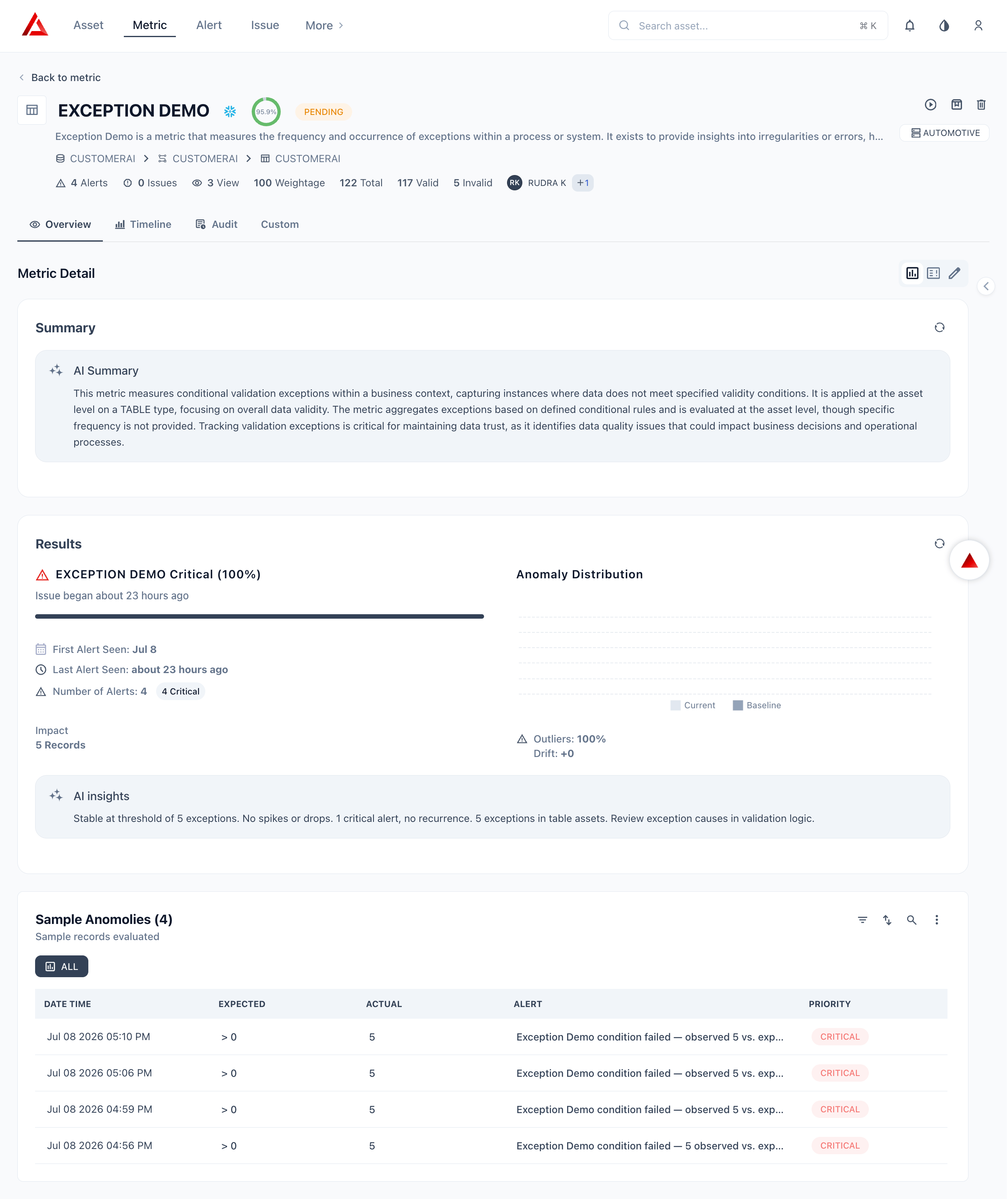
Click a metric name from the **Metric** list to open its details page. The page is organized into a persistent header and three tabs: **Overview**, **Timeline**, and **Audit**.
| Tab | What you see |
| ------------ | -------------------------------------------------------------------------------------------------------- |
| **Overview** | AI Summary, Results (alert details, Anomaly Distribution chart, AI insights), and Sample Anomalies table |
| **Timeline** | Historical trend chart of invalid record counts over time |
| **Audit** | Full change log — every create, update, and configuration change with user and timestamp |
The Overview tab contains two sections: **Summary** and **Results**.
#### Summary
The **Summary** section shows an **AI Summary** — a Prizm-generated plain-language description of what the metric measures, why it matters, and the business context it operates in. The summary refreshes each time the metric runs.
| Element | Description |
| -------------- | --------------------------------------------------------------------------------------------------- |
| **AI Summary** | Auto-generated plain-language description of the metric's purpose, data context, and current health |
#### Results
The **Results** section shows the most recent alert and anomaly details.
| Element | Description |
| ------------------------------ | --------------------------------------------------------------------------------------------------------------------------------------------------------- |
| **Alert name and severity** | The active alert with its priority (e.g., Critical 100%) |
| **Issue began** | How long ago the current issue started |
| **Severity bar** | A progress bar visualizing how far the score has deviated from baseline |
| **First Alert Seen** | Date the first alert was triggered for this issue |
| **Last Alert Seen** | Timestamp of the most recent alert |
| **Number of Alerts** | Total alert count with severity breakdown badges |
| **Impact** | Number of records affected |
| **Anomaly Distribution chart** | Plots **Current** vs **Baseline** invalid record counts. Shows **Outliers %** (how far current exceeds baseline) and **Drift** (net change from baseline) |
| **AI insights** | Prizm AI interpretation of the anomaly — summarizes whether the pattern is stable, spiking, or recurring and recommends action |
#### Sample Anomalies
Below the Results section, the **Sample Anomalies** table shows individual records that triggered alerts in the most recent run.
| Column | Description |
| ------------- | ------------------------------------------------------ |
| **Date Time** | Timestamp when the anomalous record was detected |
| **Expected** | The threshold condition (e.g., `> 0` valid records) |
| **Actual** | The observed invalid record count |
| **Alert** | The alert message generated for that run |
| **Priority** | Severity of the alert (Low / Medium / High / Critical) |
Use the **ALL** filter button to toggle between all runs or a specific time range. The search, filter, and export controls in the table header let you drill into specific anomalies.
***
## The anomaly distribution chart
The chart in the top-right of the Results panel shows two overlapping bell curves. Together they answer a single question: *how far is what the metric is seeing today from what it normally sees?*
```text theme={null}
Baseline Current
│ │
╭────╮ ╭───╮
╭╯ ╰╮ ╭──╯ ╰──╮
──────╯ ╰──────────╯ ╰────── (red tail)
```
### The baseline curve (grey)
The baseline is built from **historical run values** — by default the last 4 weeks of observations for the metric on that asset. Prizm fits a statistical distribution to those values and stores:
* **μ (mean)** — the centre of the expected range
* **σ (standard deviation)** — how wide the normal spread is A tall, narrow baseline curve means the metric has been very consistent historically. A wide, flat curve means the asset naturally varies a lot. The shape of the baseline is what makes anomaly detection self-tuning — an asset that normally swings by ±30% will not alert on a 20% change; an asset that is rock-steady will alert on a 5% change.
### The current curve (dark/coloured)
The current curve represents the **distribution of values from recent runs** — typically the last 24–48 hours. Each run produces one data point; enough recent points form a distribution that can be overlaid on the baseline.
The relative position of the two curves tells the story immediately:
| Curve position | What it means |
| --------------------------------- | --------------------------------------------------------------------- |
| Current overlaps baseline | Metric is behaving normally |
| Current shifted right of baseline | Values are higher than expected (e.g. volume spike, latency increase) |
| Current shifted left of baseline | Values are lower than expected (e.g. volume drop, freshness lag) |
| Current is flat/wide | High variability in recent runs — inconsistent behaviour |
| Red tail extending right | Extreme outliers pulling the distribution far from baseline |
In the screenshot, the current curve is shifted **right** of the baseline with a visible red tail — consistent with the Freshness metric receiving values well above the expected range.
### How drift is calculated
**Drift** is the distance between the centre of the current distribution and the centre of the baseline, measured in standard deviations (σ).
```text theme={null}
Drift = (current_mean − baseline_mean) ÷ baseline_σ
```
A drift of **+2.4** (as shown in the screenshot) means the current values are sitting 2.4 standard deviations above the historical mean. A drift of **−1.8** would mean values are 1.8 standard deviations below.
The sign tells you direction:
* **Positive drift** → values are higher than expected
* **Negative drift** → values are lower than expected The magnitude tells you severity — this maps directly to the priority bands:
| Drift magnitude | Priority band | Meaning |
| --------------- | ------------- | ----------------------------------------------- |
| 0 – 1σ | Low | Within expected statistical variation |
| 1σ – 2σ | Medium | Moderate deviation — monitor for drift |
| 2σ – 3σ | High | Significant anomaly — investigation recommended |
| ≥ 3σ | Critical | Extreme deviation — immediate action required |
### How outlier % is calculated
**Outliers %** is the percentage of recent runs whose value fell outside the baseline's expected range (beyond ±1σ by default, or a configurable threshold).
```text theme={null}
Outliers % = (number of outlier runs ÷ total recent runs) × 100
```
An outlier % of **18%** (as in the screenshot) means roughly 1 in 5 recent runs produced a value outside the normal range. An outlier % of **36%** means more than a third of recent runs were anomalous — the metric has been misbehaving consistently, not just occasionally.
Outlier % and drift are complementary signals:
| Drift | Outlier % | Interpretation |
| ----- | --------- | -------------------------------------------------------------- |
| High | High | Sustained shift — the metric has moved to a new abnormal level |
| High | Low | Single spike — one extreme run, otherwise normal |
| Low | High | Noisy metric — many small deviations, no single large one |
| Low | Low | Healthy — metric is behaving as expected |
The Freshness screenshot (drift +2.4, outliers 18%) is a **single spike** pattern — the drift is significant but only a minority of runs are outliers, suggesting a specific event rather than a persistent shift.
***
## Health states
Every metric is assigned one of four health states based on its recent alert history. The state appears as the badge in the Results panel header — for example, **"Freshness Degrading (72%)"**.
The state is not a simple pass/fail. It is calculated using a **priority burden score** that weights recent alerts more heavily than older ones, so the state reflects what is happening *right now*, not just what happened in the past.
### Step 1 — Translate priority to points
Each alert run is assigned a point value based on the drift magnitude at the time of the alert:
| Priority | Drift band | Points |
| -------- | ---------- | -------- |
| Low | 0 – 1σ | 1 point |
| Medium | 1 – 2σ | 2 points |
| High | 2 – 3σ | 3 points |
| Critical | ≥ 3σ | 5 points |
### Step 2 — Apply recency weighting
Recent alerts carry more weight than older ones. Each alert's points are multiplied by a recency factor:
| When the alert occurred | Recency weight |
| ----------------------- | -------------- |
| Last run | × 1.0 |
| Last 24 hours | × 0.7 |
| Last 7 days | × 0.3 |
### Step 3 — Compute priority burden
```text theme={null}
priority_burden = Σ (priority_points × recency_weight)
```
**Example — Degrading state:**
* Last run: 2 Medium alerts → (2 × 2) × 1.0 = 4.0
* Last 24h: 2 Medium alerts → (2 × 2) × 0.7 = 2.8
* Total burden = **6.8 → Degrading** **Example — Critical state:**
* Last run: 10 Medium + 2 High alerts → (10×2 + 2×3) × 1.0 = 26.0
* Total burden = **26 → Critical**
### Step 4 — Map burden to state
| State | Burden threshold | What it means |
| ------------- | ---------------- | -------------------------------------------------------------------------------------------------------------------- |
| **Healthy** | burden \< 2 | No meaningful anomaly activity. Metric is behaving within expected range. |
| **Stable** | 2 ≤ burden \< 5 | Minor alert activity. Worth monitoring but no urgent action needed. |
| **Degrading** | 5 ≤ burden \< 10 | Sustained anomaly activity. The metric has been consistently outside its normal range. Investigation is recommended. |
| **Critical** | burden ≥ 10 | Severe or persistent anomaly. Immediate action required. |
### Step 5 — Persistence override rules
Burden alone does not always capture the full picture. Two override rules can force a state higher regardless of the burden score:
**Force to Degrading if:**
* Alerts fired in **2 or more consecutive runs** (any priority), OR
* High or Critical priority alerts repeat in consecutive runs **Force to Critical if:**
* Any **Critical** priority alert in the last run, OR
* Consecutive runs with High or Critical priority **≥ 3 in a row** These rules ensure that a steady stream of moderate alerts — which might produce a moderate burden score — still escalates to Degrading, and that a recent Critical alert always results in a Critical state regardless of how clean prior runs were.
### The percentage in the state badge
The percentage shown alongside the state — for example, **"Freshness Degrading (72%)"** — represents the **overall anomaly burden score normalised to a 0–100% scale** for the current observation window. A higher percentage means a heavier alert burden: more alerts, higher severity, or more recent occurrence.
When a trust score is not available for a metric (Score: No), Prizm shows the state as **"Freshness Degrading (High priority activity)"** instead of the percentage. This applies to all operational metrics, which do not contribute to trust scoring.
***
## The Results panel at a glance
| Field | What it shows | How it's computed |
| ---------------------- | -------------------------------------------------- | ---------------------------------------------- |
| State badge | Current health state + burden % | Priority burden score + persistence rules |
| Issue began N days ago | How long the metric has been in an anomalous state | Days since first alert in current issue window |
| First Alert Seen | Date of the first alert in the current issue | Earliest alert timestamp in the active issue |
| Last Alert Seen | How recently the last alert fired | Most recent alert timestamp |
| Number of Alerts | Total alerts broken down by priority | Count of alert runs by priority band |
| Impact — N Records | Estimated records affected by the anomaly | Sum of record counts from anomalous runs |
| Outliers % | % of recent runs outside the expected range | Outlier runs ÷ total recent runs × 100 |
| Drift | Distance from baseline in standard deviations | (current mean − baseline mean) ÷ baseline σ |
***
## AI insights
The **AI Insights** block in the Results panel is generated by an LLM that receives the metric's computed signals and produces a plain-language summary. It follows a structured output template:
1. **Trend summary** — what the metric has been doing over the observation window
2. **Anomalies detected** — what specific deviations occurred and when
3. **Alerts summary** — how many alerts fired and at what priority
4. **Impact analysis** — how many records or assets were affected
5. **Focus areas** — where to look to diagnose and resolve the issue The AI insight shown in the screenshot is a textbook example:
> *"The metric shows a significant volume drop over the last 2 days, deviating 35% below the 4-week baseline. Three alerts were triggered, impacting approximately 120K records. This pattern aligns with previous ingestion delays. Focus should be on upstream pipeline stability and late-arriving data."*
This maps directly to: trend (volume drop, 2 days) → deviation (35% below 4-week baseline) → alerts (3) → impact (120K records) → focus area (upstream pipeline, late-arriving data).
AI insights are generated the first time a user opens the metric detail page after an alert fires. They can be manually regenerated if the metric state changes significantly — for example, after a new Critical alert arrives or after the issue is resolved.
***
## State transition lifecycle
A metric moves through states as its alert activity changes over time.
```text theme={null}
New data arrives
│
▼
Compute drift & outlier %
│
├─ No anomaly ──────────────────────────────► Healthy
│
├─ Anomaly, low burden (< 2) ───────────────► Healthy
│
├─ Anomaly, moderate burden (2–5) ──────────► Stable
│
├─ Anomaly, persistent / burden 5–10 ───────► Degrading
│
└─ Critical alert OR burden ≥ 10 ───────────► Critical
│
▼
Resolve upstream issue
│
Burden declines
│
Degrading → Stable → Healthy
```
A metric returns to **Healthy** only after enough consecutive clean runs rebuild the burden score below 2. This prevents a single clean run from prematurely resetting the state after a prolonged anomaly period.
***
## Measure details page
Click a metric name from the **Metric** list to open its details page. The page is organized into a persistent header and three tabs: **Overview**, **Timeline**, and **Audit**.
| Tab | What you see |
| ------------ | -------------------------------------------------------------------------------------------------------- |
| **Overview** | AI Summary, Results (alert details, Anomaly Distribution chart, AI insights), and Sample Anomalies table |
| **Timeline** | Historical trend chart of invalid record counts over time |
| **Audit** | Full change log — every create, update, and configuration change with user and timestamp |
The Overview tab contains two sections: **Summary** and **Results**.
#### Summary
The **Summary** section shows an **AI Summary** — a Prizm-generated plain-language description of what the metric measures, why it matters, and the business context it operates in. The summary refreshes each time the metric runs.
| Element | Description |
| -------------- | --------------------------------------------------------------------------------------------------- |
| **AI Summary** | Auto-generated plain-language description of the metric's purpose, data context, and current health |
#### Results
The **Results** section shows the most recent alert and anomaly details.
| Element | Description |
| ------------------------------ | --------------------------------------------------------------------------------------------------------------------------------------------------------- |
| **Alert name and severity** | The active alert with its priority (e.g., Critical 100%) |
| **Issue began** | How long ago the current issue started |
| **Severity bar** | A progress bar visualizing how far the score has deviated from baseline |
| **First Alert Seen** | Date the first alert was triggered for this issue |
| **Last Alert Seen** | Timestamp of the most recent alert |
| **Number of Alerts** | Total alert count with severity breakdown badges |
| **Impact** | Number of records affected |
| **Anomaly Distribution chart** | Plots **Current** vs **Baseline** invalid record counts. Shows **Outliers %** (how far current exceeds baseline) and **Drift** (net change from baseline) |
| **AI insights** | Prizm AI interpretation of the anomaly — summarizes whether the pattern is stable, spiking, or recurring and recommends action |
#### Sample Anomalies
Below the Results section, the **Sample Anomalies** table shows individual records that triggered alerts in the most recent run.
| Column | Description |
| ------------- | ------------------------------------------------------ |
| **Date Time** | Timestamp when the anomalous record was detected |
| **Expected** | The threshold condition (e.g., `> 0` valid records) |
| **Actual** | The observed invalid record count |
| **Alert** | The alert message generated for that run |
| **Priority** | Severity of the alert (Low / Medium / High / Critical) |
Use the **ALL** filter button to toggle between all runs or a specific time range. The search, filter, and export controls in the table header let you drill into specific anomalies.
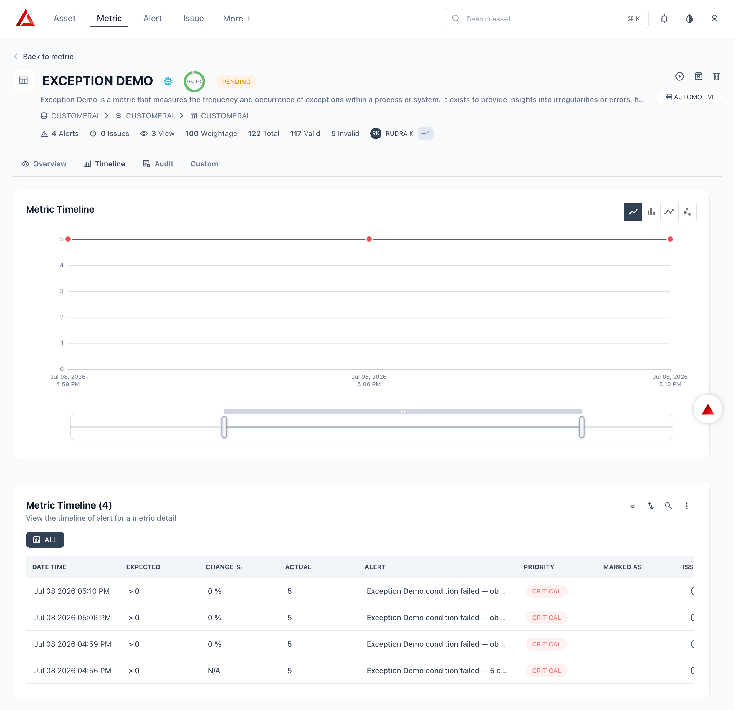
 The **Timeline** tab shows the **Metric Timeline** chart — a historical view of invalid record counts over time.
| Control | Description |
| ---------------------- | ------------------------------------------------------------------------ |
| **Chart type buttons** | Switch between line chart, bar chart, trend line, and scatter plot views |
| **X-axis** | Run timestamps |
| **Y-axis** | Invalid record count per run |
| **Range selector** | A mini-chart at the bottom lets you zoom into a specific time window |
Use the Timeline to identify when invalid counts started rising, spot recurring patterns, and compare current behavior against historical baseline.
The **Timeline** tab shows the **Metric Timeline** chart — a historical view of invalid record counts over time.
| Control | Description |
| ---------------------- | ------------------------------------------------------------------------ |
| **Chart type buttons** | Switch between line chart, bar chart, trend line, and scatter plot views |
| **X-axis** | Run timestamps |
| **Y-axis** | Invalid record count per run |
| **Range selector** | A mini-chart at the bottom lets you zoom into a specific time window |
Use the Timeline to identify when invalid counts started rising, spot recurring patterns, and compare current behavior against historical baseline.
 The **Audit** tab displays a full change log for the metric — every create, update, configuration change, and manual run is recorded with the user who made the change and a timestamp.
| Column | Description |
| --------------- | -------------------------------------------------------------------------- |
| **Date / Time** | When the action occurred |
| **User** | Who performed the action |
| **Action** | The type of change — Created, Updated, Configuration changed, Manually run |
| **Details** | A summary of what was changed (e.g., threshold value updated, rule added) |
Use the Audit log to trace when a rule was modified, who changed the threshold, or when the metric was first activated.
The **Audit** tab displays a full change log for the metric — every create, update, configuration change, and manual run is recorded with the user who made the change and a timestamp.
| Column | Description |
| --------------- | -------------------------------------------------------------------------- |
| **Date / Time** | When the action occurred |
| **User** | Who performed the action |
| **Action** | The type of change — Created, Updated, Configuration changed, Manually run |
| **Details** | A summary of what was changed (e.g., threshold value updated, rule added) |
Use the Audit log to trace when a rule was modified, who changed the threshold, or when the metric was first activated.